Split Control
Learn creating a Split Control for a split-flap display using Windows App SDK with this Tutorial
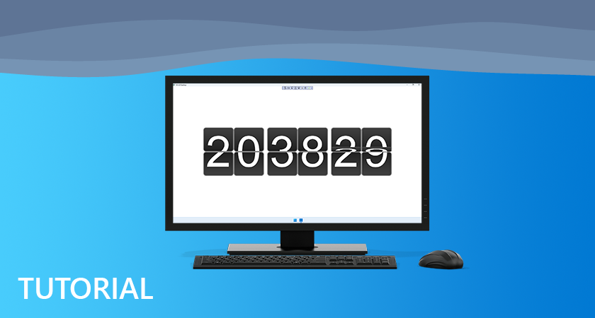
Split Control shows how to create a split-flap or Flap display using Windows App SDK.
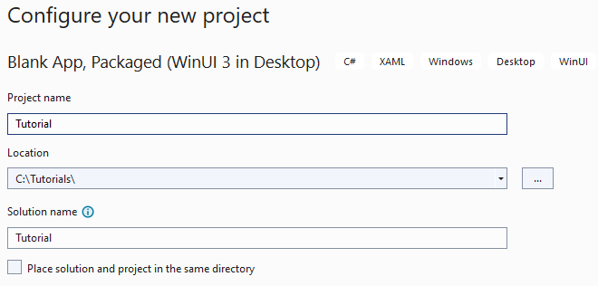
Step 1
Follow Setup and Start on how to get Setup and Install what you need for Visual Studio 2022 and Windows App SDK.
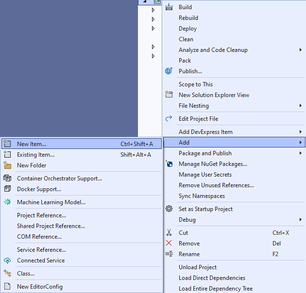
Step 2
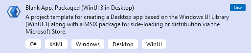
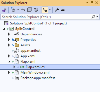
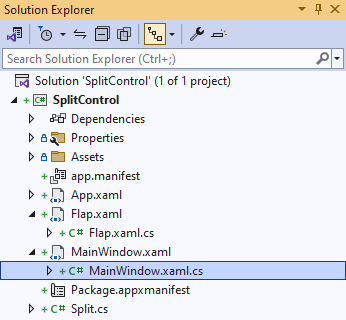
Then in Visual Studio within Solution Explorer for the Solution, right click on the Project shown below the Solution and then select Add then New Item…
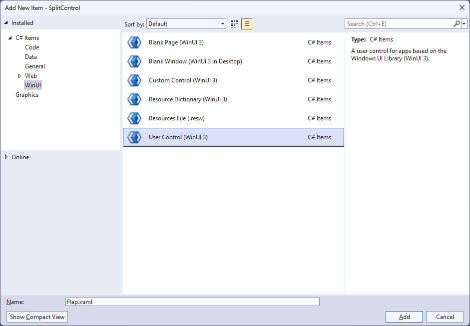
Step 3
Then in Add New Item from the C# Items list, select WinUI and then select User Control (WinUI 3) from the list next to this, then type in the name of Flap.xaml and then Click on Add.
Step 4
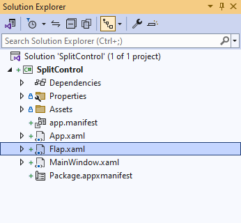
Step 5
In the XAML for Flap.xaml there will be some XAML for a Grid, above Grid, type the following XAML:
<UserControl.Resources>
    <Style x:Key="SplitLabel" TargetType="TextBlock">
        <Setter Property="FontFamily" Value="Arial"/>
        <Setter Property="Foreground" Value="White"/>
        <Setter Property="FontSize" Value="75"/>
    </Style>
    <Style x:Key="GridStyle" TargetType="Grid">
        <Setter Property="CornerRadius" Value="4"/>
        <Setter Property="Background" Value="White"/>
        <Setter Property="BorderBrush" Value="Gray"/>
        <Setter Property="BorderThickness" Value="1,1,1,1"/>
    </Style>
    <LinearGradientBrush x:Key="BackgroundBrush"
        EndPoint="0.5,1" StartPoint="0.5,0">
        <GradientStop Color="#FF202020" Offset="1"/>
        <GradientStop Color="#FF404040"/>
    </LinearGradientBrush>
    <!-- Storyboard -->

</UserControl.Resources>
This is the start of the Resources which will control the Style of the User Control.
Step 6
While still in the the XAML for Flap.xaml below <!-- Storyboard -->, type in the following XAML:
<Storyboard x:Name="FlipAnimation">
    <DoubleAnimationUsingKeyFrames Storyboard.TargetName="BlockFlip"
    Storyboard.TargetProperty="(UIElement.RenderTransform).(TransformGroup.Children)[0].(ScaleTransform.ScaleY)">
        <EasingDoubleKeyFrame Value="1" KeyTime="0">
            <EasingDoubleKeyFrame.EasingFunction>
                <BounceEase EasingMode="EaseOut" Bounces="1" Bounciness="6"/>
            </EasingDoubleKeyFrame.EasingFunction>
        </EasingDoubleKeyFrame>
        <EasingDoubleKeyFrame Value="-1" KeyTime="00:00:00.250">
            <EasingDoubleKeyFrame.EasingFunction>
                <BounceEase EasingMode="EaseOut" Bounces="1" Bounciness="6"/>
            </EasingDoubleKeyFrame.EasingFunction>
        </EasingDoubleKeyFrame>
    </DoubleAnimationUsingKeyFrames>
    <ObjectAnimationUsingKeyFrames Storyboard.TargetName="TextBlockFlipTop"
    Storyboard.TargetProperty="(UIElement.Visibility)">
        <DiscreteObjectKeyFrame KeyTime="0">
            <DiscreteObjectKeyFrame.Value>
                <Visibility>Visible</Visibility>
            </DiscreteObjectKeyFrame.Value>
        </DiscreteObjectKeyFrame>
        <DiscreteObjectKeyFrame KeyTime="00:00:00.125">
            <DiscreteObjectKeyFrame.Value>
                <Visibility>Collapsed</Visibility>
            </DiscreteObjectKeyFrame.Value>
        </DiscreteObjectKeyFrame>
    </ObjectAnimationUsingKeyFrames>
    <ObjectAnimationUsingKeyFrames Storyboard.TargetName="TextBlockFlipBottom"
    Storyboard.TargetProperty="(UIElement.Visibility)">
        <DiscreteObjectKeyFrame KeyTime="0">
            <DiscreteObjectKeyFrame.Value>
                <Visibility>Collapsed</Visibility>
            </DiscreteObjectKeyFrame.Value>
        </DiscreteObjectKeyFrame>
        <DiscreteObjectKeyFrame KeyTime="00:00:00.125">
            <DiscreteObjectKeyFrame.Value>
                <Visibility>Visible</Visibility>
            </DiscreteObjectKeyFrame.Value>
        </DiscreteObjectKeyFrame>
    </ObjectAnimationUsingKeyFrames>
</Storyboard>
This Resources is the Storyboard which contains the animations for the User Control.
Step 7
While still in the the XAML for Flap.xaml below <Grid>, type in the following XAML:
<Grid Height="80" Width="50">
    <Grid.RowDefinitions>
        <RowDefinition Height="0.5*"/>
        <RowDefinition Height="0.5*"/>
    </Grid.RowDefinitions>
    <Grid x:Name="BlockTop" Grid.Row="0" Style="{StaticResource GridStyle}"
    Background="{StaticResource BackgroundBrush}">
        <TextBlock x:Name="TextBlockTop" Style="{StaticResource SplitLabel}"
        HorizontalAlignment="Center" VerticalAlignment="Top" Margin="0,-2,0,0"/>
    </Grid>
    <Grid x:Name="BlockBottom" Grid.Row="1" Style="{StaticResource GridStyle}">
        <Grid.Background>
            <LinearGradientBrush EndPoint="0.5,1" StartPoint="0.5,0">
                <GradientStop Color="#FF202020"/>
                <GradientStop Color="#FF404040" Offset="1"/>
            </LinearGradientBrush>
        </Grid.Background>
        <TextBlock x:Name="TextBlockBottom" Style="{StaticResource SplitLabel}"
        HorizontalAlignment="Center" VerticalAlignment="Bottom"
        RenderTransformOrigin="0.5,0.5" Margin="0,0,0,-4"/>
    </Grid>
    <Grid x:Name="BlockFlip" Style="{StaticResource GridStyle}"
    Background="{StaticResource BackgroundBrush}" RenderTransformOrigin="0.5,1">
        <Grid.RenderTransform>
            <TransformGroup>
                <ScaleTransform/>
                <SkewTransform/>
                <RotateTransform/>
                <TranslateTransform/>
            </TransformGroup>
        </Grid.RenderTransform>
        <TextBlock x:Name="TextBlockFlipTop" Style="{StaticResource SplitLabel}"
        HorizontalAlignment="Center" VerticalAlignment="Top" Margin="0,-2,0,0"/>
        <TextBlock x:Name="TextBlockFlipBottom" Style="{StaticResource SplitLabel}"
        HorizontalAlignment="Center" VerticalAlignment="Bottom"
        Visibility="Collapsed" RenderTransformOrigin="0.5,0.5" Margin="0,0,0,-4">
            <TextBlock.RenderTransform>
                <TransformGroup>
                    <ScaleTransform ScaleY="-1"/>
                    <SkewTransform/>
                    <RotateTransform/>
                    <TranslateTransform Y="40"/>
                </TransformGroup>
            </TextBlock.RenderTransform>
        </TextBlock>
    </Grid>
</Grid>
This Grid will represent the Flap of the Split Control with the parts to make the top and bottom
parts along with the part which will flip over as part of the User Control.
Step 8
Step 9
You will now be in the View for the Code of Flap.xaml.cs type the following Code
below the end of the Constructor of public Flap() { ... }:
private string _value;
private string _from;

public string Value
{
    get { return _value; }
    set
    {
        _value = value;
        if (_from != null)
        {
            if (_from != value)
            {
                TextBlockTop.Text = TextBlockFlipBottom.Text = value;
                TextBlockFlipTop.Text = _from;
                FlipAnimation.Begin();
                FlipAnimation.Completed -= (s, e) => { };
                FlipAnimation.Completed += (s, e) =>
                    TextBlockBottom.Text = _from;
            }
        }
        if (_from == null)
        {
            TextBlockFlipTop.Text = TextBlockBottom.Text = value;
        }
        _from = value;
    }
}
The class for Flap represents the User Control for the Flap and includes a
Property of Value which contains triggers for the animation of the Storyboard when set.
Step 10
Then in Visual Studio within Solution Explorer for the Solution, right click on the Project shown below the Solution and then select Add then New Item…
Step 11
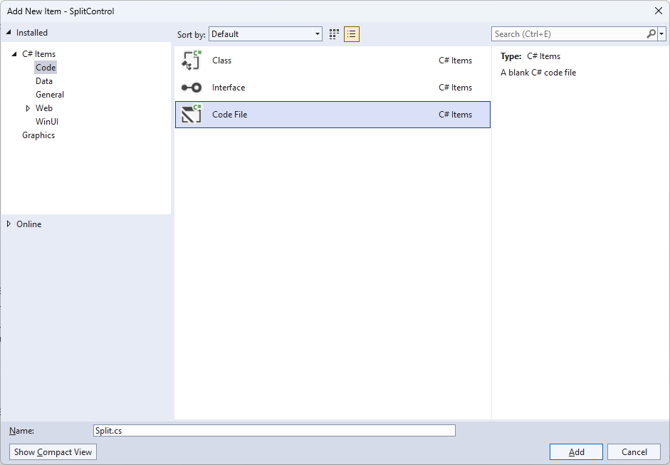
Then in Add New Item from the C# Items list, select Code and then select Code File from the list next to this, then type in the name of Split.cs and then Click on Add.
Step 12
Step 13
You will now be in the View for the Code of Split.cs, within this type the following Code:
using Microsoft.UI.Xaml;
using Microsoft.UI.Xaml.Controls;
using System;
using System.Linq;

namespace SplitControl;

public enum Sources
{
    Value, Time, Date, TimeDate
}

public class Split : StackPanel
{
    // Constants, Members, Dependency Property & Property

    // Set Element & Add Element Methods

    // Add Layout Method & Value Property

    // Constructor

}
There are using statements for the User Control, a namespace for SplitControl with an enum for the Sources
of the Split Control along with a class of Split that will represent the User Control.
Step 14
While still in the namespace of SplitControl in the class of Split after the Comment
of // Constants, Members, Dependency Property & Property type the following Constants, Members,
Dependency Property and Property:
private const char space = ' ';
private const string time = "HH mm ss";
private const string date = "dd MM yyyy";
private const string date_time = "HH mm ss  dd MM yyyy";
private const string invalid_source = "Invalid argument";

private string _value;
private int _count;

public static readonly DependencyProperty SourceProperty =
DependencyProperty.Register(nameof(Source), typeof(Sources),
typeof(Split), new PropertyMetadata(Sources.Time));

public Sources Source
{
    get { return (Sources)GetValue(SourceProperty); }
    set { SetValue(SourceProperty, value); }
}
The Constants include formats for the time and date that can be displayed with the Split Control along with
Members for the Split Control and a Dependency Property and Property for the Source to be used.
Step 15
While still in the namespace of SplitControl in the class of Split after the Comment
of // Set Element & Add Element Methods type the following Methods:
private void SetElement(string name, char glyph)
{
    var element = Children.Cast<FrameworkElement>()
    .FirstOrDefault(f => (string)f.Tag == name);
    if (element is Flap flap)
    {
        flap.Value = glyph.ToString();
    }
}

private void AddElement(string name)
{
    FrameworkElement element = name == null
        ? new Canvas
        {
            Width = 5
        }
        : new Flap()
        {
            Tag = name
        };
    Children.Add(element);
}
The Method of SetElement will be used to set a Flap to a particular Value
and AddElement will be used to either add a Flap or a Canvas for a Space.
Step 16
While still in the namespace of SplitControl in the class of Split after the Comment
of // Add Layout Method & Value Property type the following Method and Property:
private void AddLayout()
{
    var array = _value.ToCharArray();
    var length = array.Length;
    var list = Enumerable.Range(0, length);
    if (_count != length)
    {
        Children.Clear();
        foreach (int item in list)
        {
            AddElement((array[item] == space)
            ? null : item.ToString());
        }
        _count = length;
    }
    foreach (int item in list)
    {
        SetElement(item.ToString(), array[item]);
    }
}

public string Value
{
    get { return _value; }
    set { _value = value; AddLayout(); }
}
The Method of AddLayout creates the look-and-feel for the User Control and the
Property of Value will setup the display of the Split Control using the Method of AddLayout.
Step 17
While still in the namespace of SplitControl in the class of Split after the Comment
of // Constructor type the following Constructor:
public Split()
{
    Orientation = Orientation.Horizontal;
    var timer = new DispatcherTimer()
    {
        Interval = TimeSpan.FromMilliseconds(250)
    };
    timer.Tick += (object s, object args) =>
    {
        if (Source != Sources.Value)
        {
            var format = Source switch
            {
                Sources.Time => time,
                Sources.Date => date,
                Sources.TimeDate => date_time,
                _ => throw new ArgumentException(invalid_source)
            };
            Value = DateTime.Now.ToString(format);
        }
    };
    timer.Start();
}
The Constructor will setup a DispatcherTimer to be used to display the Value of the Split Control.
Step 18
Step 19
In the XAML for MainWindow.xaml there will be some XAML for a StackPanel, this should be Removed:
<StackPanel Orientation="Horizontal"
HorizontalAlignment="Center" VerticalAlignment="Center">
    <Button x:Name="myButton" Click="myButton_Click">Click Me</Button>
</StackPanel>
Step 20
While still in the XAML for MainWindow.xaml above </Window>, type in the following XAML:
<Viewbox>
    <local:Split Padding="50" Source="Time"/>
</Viewbox>
This XAML contains a ViewBox and the User Control of Split with the Source set to Time.
Step 21
Step 22
In the Code for MainWindow.xaml.cs there be a Method of myButton_Click(...) this should be Removed by removing the following:
private void myButton_Click(object sender, RoutedEventArgs e)
{
    myButton.Content = "Clicked";
}
Step 23
Step 24
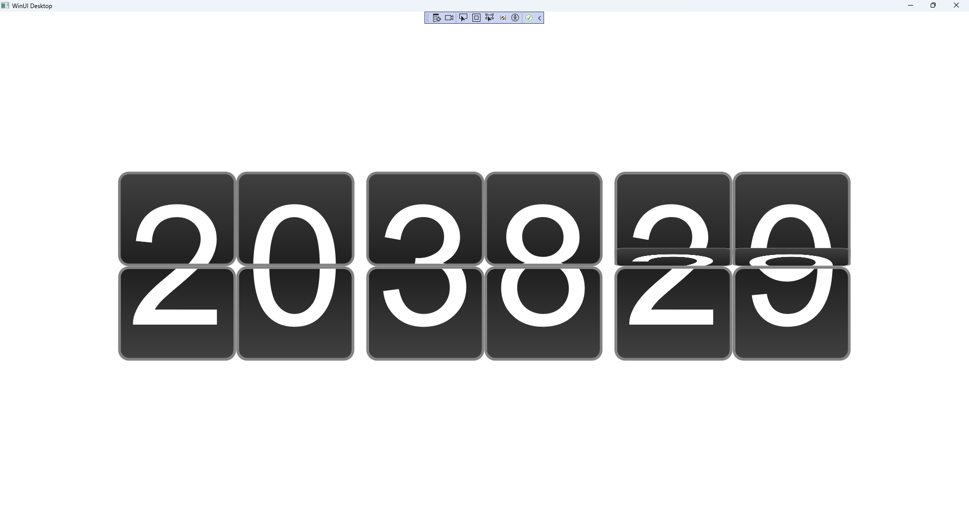
Once running you will see the Split Control displaying the current Time.
Step 25
