Custom CheckBox
Learn creating a Custom CheckBoxusing Windows App SDK with this Tutorial
Custom CheckBox shows how to create a Style for a CheckBox using Windows App SDK.
Step 1
Follow Setup and Start on how to get Setup and Install what you need for Visual Studio 2022 and Windows App SDK.

Step 2
Step 3
In the XAML for App.xaml below the Comment
of <!-- Other app resources here --> type in the following XAML:
<Style x:Key="CustomCheckBox" TargetType="CheckBox">
    <Setter Property="Background" Value="Transparent"/>
    <Setter Property="Foreground"
    Value="{ThemeResource SystemControlForegroundBaseHighBrush}"/>
    <Setter Property="Padding" Value="5,5,0,0"/>
    <Setter Property="HorizontalAlignment" Value="Left"/>
    <Setter Property="VerticalAlignment" Value="Center"/>
    <Setter Property="HorizontalContentAlignment" Value="Left"/>
    <Setter Property="VerticalContentAlignment" Value="Top"/>
    <Setter Property="FontFamily"
    Value="{ThemeResource ContentControlThemeFontFamily}"/>
    <Setter Property="FontSize"
    Value="{ThemeResource ControlContentThemeFontSize}"/>
    <Setter Property="UseSystemFocusVisuals" Value="True"/>
    <Setter Property="Template">
        <Setter.Value>
            <ControlTemplate TargetType="CheckBox">
                <Grid BorderBrush="{TemplateBinding BorderBrush}"
                    BorderThickness="{TemplateBinding BorderThickness}"
                    Background="{TemplateBinding Background}">
                    <Grid.ColumnDefinitions>
                        <ColumnDefinition Width="30"/>
                        <ColumnDefinition Width="*"/>
                    </Grid.ColumnDefinitions>
                    <!-- Visual State Groups -->

                    <!-- Content -->

                </Grid>
            </ControlTemplate>
        </Setter.Value>
    </Setter>
</Style>
This XAML is part of a Style of CustomCheckBox that will be used to target a CheckBox
which will contain some Visual State Groups and Content for the Custom CheckBox.
Step 4
While still the XAML for App.xaml below the Comment
of <!-- Visual State Groups --> type in the following XAML:
<VisualStateManager.VisualStateGroups>
    <VisualStateGroup x:Name="CombinedStates">
        <VisualState x:Name="Unchecked">
            <Storyboard>
                <ObjectAnimationUsingKeyFrames
                    Storyboard.TargetProperty="Opacity"
                    Storyboard.TargetName="InnerRectangle">
                    <DiscreteObjectKeyFrame KeyTime="0" Value="0"/>
                </ObjectAnimationUsingKeyFrames>
            </Storyboard>
        </VisualState>
        <VisualState x:Name="Checked">
            <Storyboard>
                <ObjectAnimationUsingKeyFrames
                    Storyboard.TargetProperty="Opacity"
                    Storyboard.TargetName="InnerRectangle">
                    <DiscreteObjectKeyFrame KeyTime="0" Value="1"/>
                </ObjectAnimationUsingKeyFrames>
            </Storyboard>
        </VisualState>
    </VisualStateGroup>
</VisualStateManager.VisualStateGroups>
This XAML is for the Visual State Groups that will represent the States for the CheckBox including
how it will behave when it is Unchecked and when it is Checked for the Custom CheckBox.
Step 5
Then in the XAML for App.xaml below the Comment
of <!-- Content --> type in the following XAML:
<Grid>
    <Rectangle x:Name="NormalRectangle"
    Height="30" Width="30" RadiusY="10" RadiusX="10"
    UseLayoutRounding="False" StrokeThickness="2"
    Stroke="Salmon" Fill="LightSalmon"/>
    <Rectangle x:Name="InnerRectangle" Height="20"
    Width="20" RadiusY="4" RadiusX="4"
    UseLayoutRounding="False" StrokeThickness="2"
    Stroke="Goldenrod" Fill="Gold" Opacity="0"/>
</Grid>
<ContentPresenter x:Name="ContentPresenter" Grid.Column="1"
AutomationProperties.AccessibilityView="Raw"
ContentTemplate="{TemplateBinding ContentTemplate}"
ContentTransitions="{TemplateBinding ContentTransitions}"
Content="{TemplateBinding Content}"
HorizontalAlignment="{TemplateBinding HorizontalContentAlignment}"
Margin="{TemplateBinding Padding}" TextWrapping="Wrap"
VerticalAlignment="{TemplateBinding VerticalContentAlignment}"/>
This XAML is the Content for the layout of a CheckBox when the Style is applied for the Custom CheckBox.
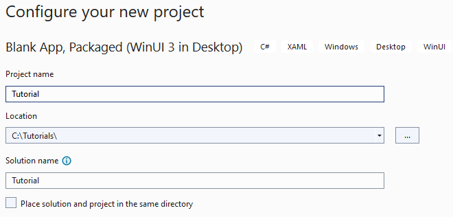
Step 6
Step 7
In the XAML for MainWindow.xaml there will be some XAML for a StackPanel, this should be Removed:
<StackPanel Orientation="Horizontal"
HorizontalAlignment="Center" VerticalAlignment="Center">
    <Button x:Name="myButton" Click="myButton_Click">Click Me</Button>
</StackPanel>
Step 8
While still in the XAML for MainWindow.xaml above </Window>, type in the following XAML:
<CheckBox HorizontalAlignment="Center" Content="CheckBox"
Style="{StaticResource CustomCheckBox}"/>
This XAML contains a CheckBox with Style set to the
StaticResource of CustomCheckBox from App.xaml.
Step 9
Step 10
In the Code for MainWindow.xaml.cs there be a Method of myButton_Click(...) this should be Removed by removing the following:
private void myButton_Click(object sender, RoutedEventArgs e)
{
    myButton.Content = "Clicked";
}
Step 11
Step 12
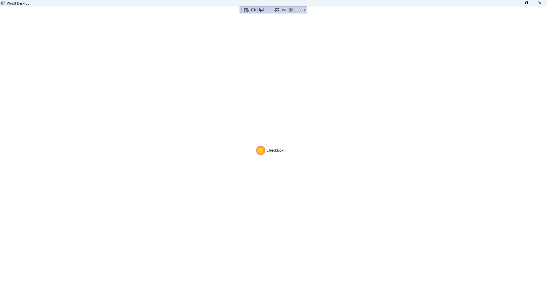
Once running you will see the Custom CheckBox displayed which you can then set to Checked.
Step 13
